“Knowledge is the only instrument of production that is not subject to diminishing returns.” [John Clarke]
Abstract
This exercise was given by a Math genius and a very likable person, Nidal Sh., to former colleagues of mine. I enjoyed it very much. I think it is a very useful exercise to sharpen your understanding for data and for risk in general.
Scenario:
You are a fund manager (FX, Real Estate, Equities or Fixed Income). You need to perform two presentations:
a) Show your CEO that your fund is very risky compared to the other ones. You need more capital, budget and other resources to deal with that properly.
b) Show a potential client that your fund generates safe income and that it is less risky than the other high-speculative funds.
Your Quant department has provided all possible monthly returns for each fund - 2,500 possible outcomes for each one.
Generate as many risk definitions as possible and prepare your two presentations. Keep in mind that you need to reverse your arguments completely between your presentations. And try to visualize your data (introduce meaningful graphics).
You can download the 182 KB Excel data file below. Please note that this file is for information purposes only. It comes without any warranty - please read my disclaimer.
fund_returns.xlsx [173 KB Excel file, download, open, and use at your own risk]
Risk Analysis Solution
I hope you have tried yourself to generate as many arguments, risk definitions and presentation graphics as possible. Go back to the scenario page if you have not :-)
Solution [There are many possible approaches - I just present mine here:]
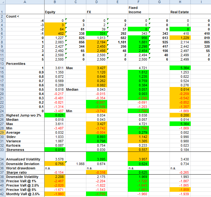
First sort all returns of each fund. Then calculate as many risk measures as possible. I have calculated these - best values are highlighted in green, worst values in orange:
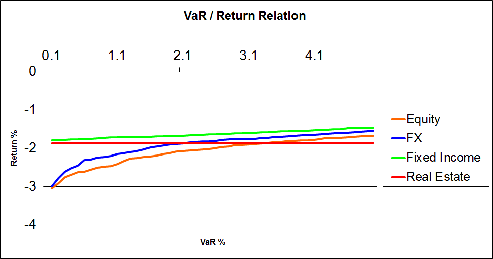
The VaR / Return relations:
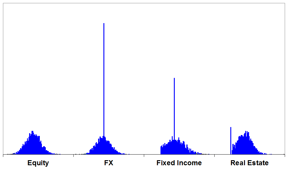
The return distributions with a “boring” standard graphic:
And finally the distributions shown with a more interesting scatter diagram. I got the idea from Viktor B., a former colleague of mine who is a renumeration expert. He also inspired the graphics I used when I published the (external link!) salaries of all lawyers of the banking group I worked for.
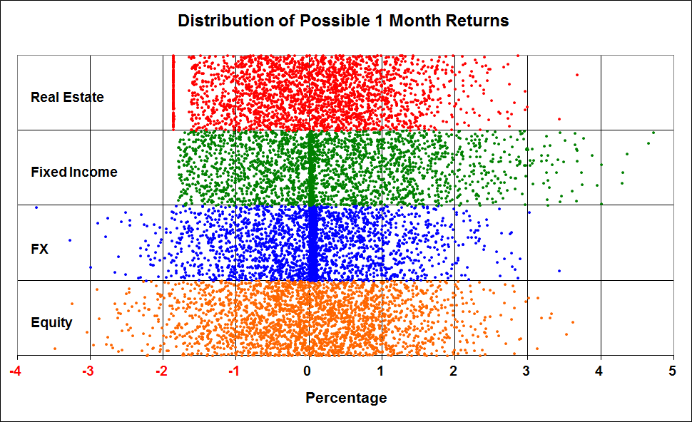
With this graphic you can easily see that Real Estate returns have a loss border - actually, when losses are cut and the collaterals are being used, the banks face a fix effort which moves the lower boundary to the left and which leaves a small gap. Fixed Income returns also show a lower boundary, but a certain concentration around 0. FX returns show a bigger concentration around 0 and a wider unbound distribution. Equity returns are normally distributed here.